The Misrepresentation of the “Average Rate of Return”
Right after my wife and I got married, we did what everyone tells you to do. We sat down with a financial planner at a large, well-known firm. We thought it was the smart move. We trusted the person because he had a fancy title and a nice office.
He developed a plan for us. A plan so generic and mass-produced it seemed almost too easy. Here’s what it was — and something tells me you may recognize it:
“Dollar cost average 20% of your income into a mix of government-sponsored retirement accounts. Max out your 401(k) first, then any additional money goes into a Roth IRA. Invest in a well-diversified portfolio of mutual funds. The stock market has its ups and downs, but it averages around 8% per year. You’re in it for the long haul — don’t worry about the down years. In 30 years it’s going to be worth X.”
Then he pulled up a compound interest calculator. Put our savings amount in. Put 8% in. And showed us a big, beautiful, uninterrupted hockey stick curve climbing toward a number that made retirement look inevitable.
“This is the power of compound interest,” he said.
Here’s what he didn’t tell us: most people never actually experience that curve. And the reason why is hiding in plain sight — in the very number he used to build it.
The Number That Drives Every Retirement Projection — And Why It’s Wrong
The average rate of return is not a lie. It is a mathematically accurate figure. The S&P 500 did average roughly 10.13% annually from 1984 to 2023. That is a real number.
The problem is what happens when you put that number into a compound interest calculator and treat the output as a realistic projection of what your account will actually be worth.
It won’t be.
Here’s why.
Average return and actual yield are not the same thing. The average return calculates as if you earn a smooth positive return every single year — as if losses simply don’t exist. But they do exist. And losses don’t cancel out the way most people assume.
Take an exaggerated example to make the math clear. Start with $1,000. Year one: up 100%. You have $2,000. Year two: down 50%. You have $1,000. Year three: up 100%. You have $2,000. Year four: down 50%. You have $1,000.
Your average return over four years? Positive 25%. That is the number a fund or advisor will market.
Your actual yield? Zero. You started with $1,000 and ended with $1,000.
Layer in fees, taxes, and inflation — and you actually lost value while being told you averaged 25% per year.
This is not a trick. It is actual mathematics. And it is the reason the retirement projections people are shown 30 years before retirement bear so little resemblance to the account balances they find when they arrive there.
Why Losses Hurt More Than Gains Help
Warren Buffett’s two rules of investing are famous: Rule #1 — don’t lose money. Rule #2 — don’t forget Rule #1.
Most people read that as a clever joke. Buffett is serious. He understands the mathematics of loss recovery that most retail investors have never been shown.
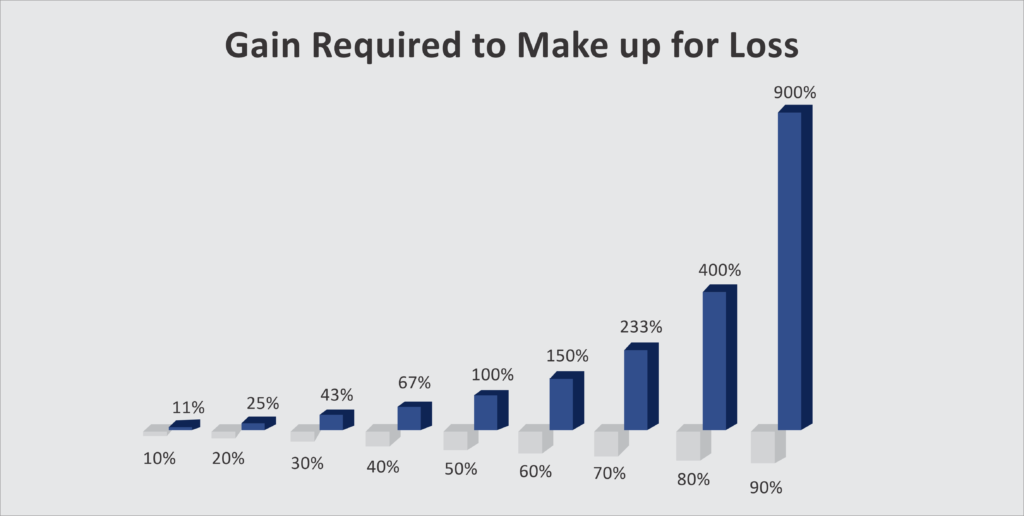
When you lose money, it takes a disproportionately larger gain to get back to where you started. A 10% loss requires an 11% gain to recover. A 20% loss requires a 25% gain. A 30% loss requires a 43% gain. A 50% loss requires a full 100% gain just to break even — and at that point, you haven’t made a dollar. You’ve simply made up for what you lost.
This asymmetry is permanent. It doesn’t average out. It doesn’t get better over time. Every significant drawdown creates a mathematical hole that takes years of positive returns just to escape — and during those recovery years, the account isn’t compounding toward your retirement goal. It’s fighting its way back to zero.
The investor who avoids a 50% loss and earns 6% consistently does not just perform similarly to the investor who swings between +50% and -50%. They dramatically outperform them — because they were never digging out of a hole.
Defense is not the boring half of wealth building. It is arguably the most important half.
📖 Related: The Cost of Chasing Averages: What the Sharpe Ratio Reveals About the S&P — Risk-adjusted returns tell a very different story than raw average returns. Most investors have never seen their portfolio evaluated this way.
What Forty Years of Real Data Actually Shows
Let’s take this out of hypotheticals and run the actual numbers.
Assume a 25-year-old starting in 1984 with an average salary of $30,000, investing 10% of income in the S&P 500, increasing contributions by 5% every year for 40 years. To give this scenario every possible benefit of the doubt: assume they dollar-cost averaged through every down year, paid zero fees, owed zero taxes, and faced zero inflation adjustment.
The compound interest calculator at 10.13% — the actual average for that period — projects a retirement balance of approximately $2.6 million.
Now run the same contributions against the actual annual returns of the S&P 500 year by year, accounting for real losses in real years.
The actual balance: nearly $1 million less. About 35% below the projection — before a single dollar of fees, taxes, or inflation is accounted for.
Add a conservative 1% AUM fee. Now you’re 48% below the average return projection. Apply a 28% tax rate on a traditional tax-deferred account, and roughly $375,000 of what remains belongs to the government, not you. The realistic after-tax, after-fee balance lands somewhere around $966,000 — approximately $1.7 million short of what the average-rate projection promised. About 63% less than expected.
And this scenario used one of the most favorable 40-year windows in market history — a period that included the largest monetary expansion ever recorded, which artificially inflated returns in ways that are unlikely to repeat.
If you had reached your target retirement date in 2018 — before the COVID stimulus surge — and had already shifted toward lower-volatility assets as conventional wisdom recommends, your account would have been under $827,000 before fees and taxes. Probably under $600,000 after.
📖 Related: Artificial Wealth: When Prices Rise but Value Doesn’t — Much of the exceptional market performance in recent decades was driven by monetary expansion, not underlying business value creation. Understanding the difference matters enormously for forward-looking projections.
The Objection Everyone Raises — and Why It Doesn’t Hold
“But the average accounts for the bad years. Some years are up 20%, some down 20% — the average smooths it out.”
This is the most common objection. And it reflects a misunderstanding of how compounding actually works.
Compounding is multiplicative, not additive. When you lose 20%, you don’t need a future 20% gain to recover — you need 25%. The sequence of returns matters as much as the returns themselves. Two investors with identical average returns but different sequences end up at dramatically different ending balances depending on when the losses hit relative to their contribution and withdrawal timeline.
“But just buy more on the down years — that’s dollar cost averaging.”
In theory, yes. In practice, the average person’s capacity to buy more is lowest precisely when markets are down — because economic downturns and job uncertainty tend to accompany market downturns. And even investors who do continue contributing through drawdowns still fall short of what average-rate projections implied, because the math of loss recovery is not helped by adding new dollars to a position that needs 100% gains to break even.
Interrupted vs. Uninterrupted Compounding
Here is the distinction that changes everything — and the one almost no advisor will walk you through clearly.
Uninterrupted compounding is what the hockey stick chart shows. It assumes your account grows at a consistent rate, year after year, with no losses, no resets, no holes to dig out of. That curve is mathematically beautiful. And for most market-based investors, it is a fiction.
Interrupted compounding is what actually happens. Periodic losses break the compounding sequence. The recovery period consumes years of potential growth. The ending balance is structurally, mathematically lower than the uninterrupted projection — not because of bad luck, but because of how math works.
The investor who can find assets that grow at a lower rate but without interruption will, over long enough time horizons, frequently outperform the investor chasing higher average returns at the cost of periodic significant losses.
This is not a fringe observation. It is the reason sophisticated capital allocators — family offices, endowments, institutions — allocate meaningful portions of their capital to contractual, guaranteed, non-correlated positions. Not because those positions offer the highest average return. Because they offer uninterrupted compounding that is never exposed to volatility drag.
📖 Related: Why Banks Love Life Insurance — Bank of America holds over $25 billion in life insurance on their balance sheet. They are not doing it for the yield. They are doing it because guaranteed, uninterrupted, tax-advantaged growth has a value that average-return comparisons consistently understate.
📖 Related: Compared to What? The Financial Spectrum No One Explains — Before evaluating any return, you need to ask what job that dollar is assigned to do. The comparison only makes sense if both sides of it are doing the same job.
What This Means for Your Plan
This article is not an argument against the stock market. You can make significant money in public markets. The problem is not the market itself — the problem is the way performance is illustrated and the expectations that those illustrations create.
If projections built on average returns worked, we would not have a retirement crisis. The average 401(k) balance for Americans over 65 is approximately $272,000. Pension funds in major cities across the country are in deficit — having made promises based on average return assumptions that real-world compounding could not deliver.
The math was not wrong. The way it was applied was.
A past average rate of return should never be used to project a future balance. Using it as such is misrepresentation — even when accompanied by the small-print disclosure that past returns don’t guarantee future results. The disclosure doesn’t fix the misleading implication. It just provides legal cover for it.
If you want to stress-test your own projections against realistic math — accounting for actual loss sequences, fees, taxes, and inflation — The Fragility Test is a free diagnostic that asks the questions most financial plans never do.
And if you’re ready to explore what a capital structure looks like when some of your dollars are protected from volatility drag entirely, the team at Producers Wealth builds exactly that for business owners and high-income earners.
📖 Related: A Nation of Speculators — Most retail investors are speculating without knowing it. Understanding the math in this article is the first step to understanding why that distinction matters.
📖 Related: The Gap Between the Marketing & the Math — The most-read article on this site. Goes deeper on what fees, taxes, and the behavior gap do to the numbers your advisor shows you.
Not ready to talk yet? Join the Wealth & Liberty newsletter — one idea per week that gives you a sharper framework for thinking about your own money.
The Critical Thinking Three
- Pull out any retirement projection you’ve been shown. What rate of return was used — and was it an arithmetic average or a compound annual growth rate? If the person who showed it to you can’t answer that question clearly, the projection is built on a number that overstates what you will likely accumulate.
- What would your projected retirement balance be if you accounted for one meaningful loss every ten years, a 1% annual fee, inflation at 3%, and taxes at your current marginal rate? Run the actual math. Most people have never done this. The result is usually sobering — and clarifying.
- How much of your capital is currently in assets that compound without interruption — and how much is exposed to volatility drag that resets the compounding sequence every time a significant loss occurs? What would it take to shift more of your capital structure toward uninterrupted growth?
Sources: National Council on Aging — Retirement Crisis | CNN — Average 401k Balance by Age | Macrotrends — S&P 500 Historical Data